
This document describes how to use configure Yate's appearance. Primarily this pertains to the main window but there is a degree of configurability for database files as well.
All screenshots in this document were taken on macOS Tahoe.
Vertically Sizing the Main Window
Configuring the Toolbar Display
Selecting Which Columns are Displayed in the File List Area
Configuring Edit Panel Buttons
Saving Edit Panel Button Layouts
Other File List Appearance Settings
Other File Browser Appearance Settings
The main window supports three working areas. The File Browser is an optional Finder like view into a single folder. The File List area presents a list of loaded files with configurable columns. The Edit Panel area displays panels containing fields where you can edit metadata.

The display of the File Browser is optional. This is controlled by the Hide / Show File Browser menu item on the Window menu.
The Edit Panel area can be displayed as part of the main window or detached into a separate window. This is controlled by the Window menu's Detach / Attach Edit Panels menu items.
Each of the three potential work areas on the main window has an assigned position. You can arrange them in any order to meet your preferences. This is done via the Window menu's Window Panel Layout submenu.

The submenu displays each of the possible layouts. Remember that these layouts describe the position of the three working areas when displayed. If the edit panels are detached, they will simply not appear in the main window. When reattached, they will go back to their defined location.
When the Edit Panels are detached, they appear in their own window which can be minimized or closed. Clicking on the dock icon will cause a closed Edit Panel window to be redisplayed. Note that the main window and a detached Edit Panels window are treated as if they are one window. Sheets (popup panels) are displayed on whichever window has the focus and both windows are disabled whenever one is disabled.
The main window can be resized to be smaller than the minimum vertical size of an Edit Panel. When this is done you can scroll the edit panel by doing so by scrolling any part of the panel except in a multi line text field.
The following screenshot shows the main window resized such that the entire Info Editing Panel cannot be entirely displayed. The window also has a non default layout for the three work areas.

On the File Browser's context menu you can configure which content is displayed and how by using the items on the View Options submenu.
Also on the context menu you can pin folders for fast access.
The Information Area sometimes displayed at the bottom of the File Browser is configurable. It might be obvious but the Information Area is not displayed unless the File Browser is displayed.
You can control the display of the information area by means of the Window menu's Enable/Disable File Browser Information Area item.
You control what content optionally gets displayed by means of the Window menu's Display Artwork/Audio Info in File Browser Information Area menu item.
When displaying audio information and a single file is selected in the file list area, the display will be similar to the following screenshot:

When audio information is displayed and a Stem file (stem.mp4) is selected, double clicking in the panel will display the stem metadata. If a WAV file is selected and it has BEXT Metadata metadata, double clicking will display the metadata.
A popup version of the audio information panel can be displayed at any time by right clicking on a file and selecting Audio Information from the file list area's context menu or by selecting a single file and doing a View>Audio Information.
When displaying artwork and all selected file's have the same default artwork item, the display will be similar to the following screenshot:

The image has a context menu item named Get Info. Selecting the menu item will display a panel presenting the image's properties. The property panel can be dismissed by the Escape key. Double clicking on the image will display a full artwork edit panel. The choice of which panel to display is made as follows:
The toolbar can be displayed or hidden by means of the Window menu's Hide/Show Toolbar item.
How the toolbar is displayed and the size of the icons depends on the version of macOS which is running. While Customize Toolbar can be started from the Window menu, it is preferable to enter the customization process by right clicking on the toolbar. The displayed menu may have additional settings depending on the version of macOS and whether the Title bar is displayed. These may include selecting a large or small icon display and the display of descriptive text under icons.
On some OS versions the display of the title bar is required if you want to display text under the toolbar icons.The Window menu's Show / Hide Title Bar menu item will toggle the display of the Title Bar. All previous screenshots did not have the Title Bar displayed. The following screenshot has the Title Bar displayed and displays text under each icon:

Notice that Yate is now displayed to the left of the window banner and that toolbar items are displayed under the window banner. Personally we never display a window banner as it seems like a waste of vertical space in the window. However, if you prefer the display of the applications's name, we provide another means of doing it without the wasted space. Do not show the title bar and simply drag a Yate toolbar item to the left of the toolbar. This gives you an application name without the wasted space. See the following screenshot.
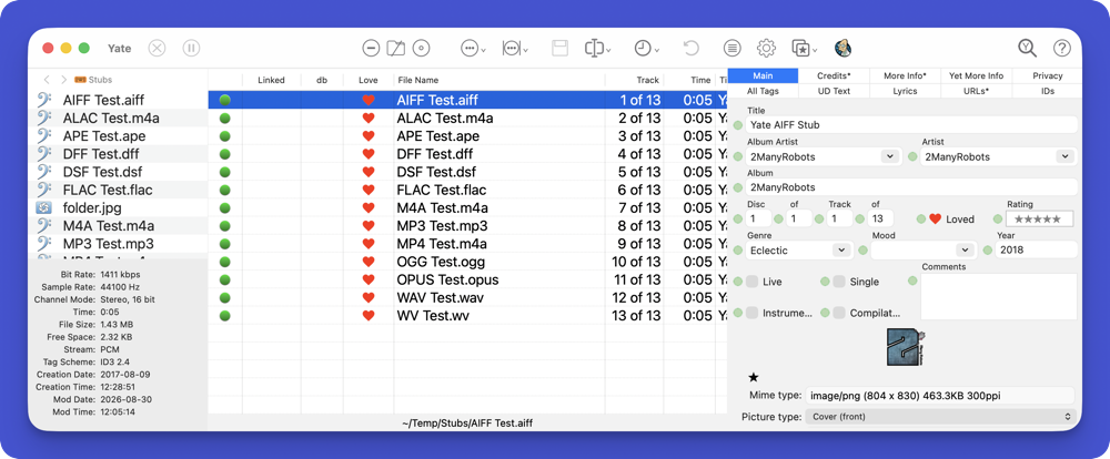
As far as changing the content of the toolbar, do a Customize Toolbar and drag items to the toolbar or out of the toolbar.
The appearance of toolbar buttons can be configured via Settings - File List - Toolbar icon appearance. There are three settings which can be made.
You can save and reload any number of named toolbar layouts. A saved toolbar layout retains the toolbar items, the display mode and depending on the OS, the size of the icons. It also retains the current Settings - File List - Toolbar icon appearance settings.
You can save and restore toolbar layouts by right clicking the Window menu's Toolbar Layouts item. A menu will be displayed which allows you to manage toolbar layouts and activate any saved ones. It also duplicates the submenu which can change the icon appearance.
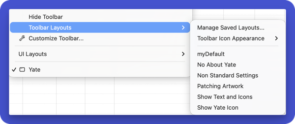
In the above screenshot, myDefault is the name of a saved toolbar layout. Manage Saved Layouts will display the following panel.
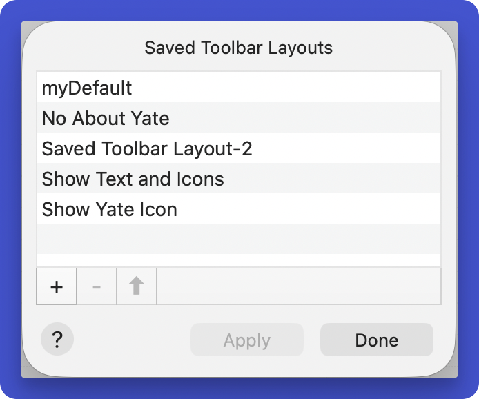
The panel displays the previous saved items. You can create, rename, delete and update saved items. When you create a new item it will reflect a copy of the current toolbar. You can update the contents of an existing item by selecting it and hitting the ⬆︎ button. You can rename an item by editing it inline.
You should name your saved settings appropriately as the only way of seeing what they represent is to apply them.
An Apply button is provided so that you can apply an item directly from the panel.
Selecting which columns are displayed is performed in a variety of ways. The first is to right click on any column header and select the desired columns one at a time at the bottom of the displayed menu. The names of columns already displayed are preceded by a checkmark.

To configure more than one column at a time select the Manage Displayed Columns menu item. A panel such as in the following screenshot will be displayed.

If you are consistently going to use the above method, you can hide the column list on the context menu by selecting Hide Column List.
You can save and reload any number of saved column layouts. A saved column layout also attempts to retain the width of each column. You can save and restore column layouts by right clicking on any column header and selecting Saved Column Layouts.

The displayed submenu has Manage Saved Layouts at the top and any previously saved column layout at the bottom. Clicking on a previously saved layout, will cause it to be displayed. Manage will display a panel as follows:

The panel displays the previous saved items. You can create, rename, delete and update saved items. When you create a new item it will reflect the main window's column layout. You can update the contents of an existing item by selecting it and hitting the ⬆︎ button. You can rename an item by editing it inline.
Columns can be autosized to their full width or to a limited width. When resizing to full width the maximum size of a column will be 2000 points. When limiting the size it will be restricted to a maximum of 300 points.
Right click anywhere on a column header (or on a specific column) and select Auto Size.

All menu items which do not contain All work on the column which was clicked. Note that the Downsize functions limit the size of columns which might be wider than a column which was limited.
You can automatically do an Autosize Limited on all columns after loading files. To do so, enable the Settings - File List - Autosize column widths after loading files option. Depending on which version of Yate you first installed, the setting may or may not be enabled.
Edit Panel buttons are used to access built in and custom edit panels.

The above screenshot displays the out of the box layout. You can rearrange the buttons by holding down the Shift key and dragging a button to a new position. The only special button is the last. The last button is used by various functionality which automatically displays a specific edit panel when there is no available empty button to display the name of the required edit panel.
To change the edit panel referenced by a button, you would typically right click on the button and select the panel you want to display.
Yate has a lot of edit panels and there may be some that you have no interest in. These panels can be hidden from the menu by selecting Manage Hidden Edit Panels from the context menu. On the displayed window you can specify which panels you want to hide. Note than when a panel is hidden it can still be accessed on the context menu's Hidden Edit Panels submenu.
If you click on the selected panel button a menu is displayed which lists the name of all non hidden edit panels. If available it also displays the name of the previously selected panel on the button. This makes it easy to toggle between two edit panels.
Two rows of five buttons is the initial configuration. You can configure a different layout as described in the following screenshot:
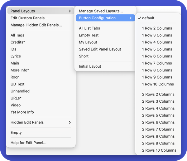
You can have one or two rows of buttons where each row contains two to ten buttons.
You can save different named sets of edit panel button layouts. On the context menu, click on Saved Button Layouts. The displayed menu lists the names of all saved layouts you have created and has a Manage Save Layouts item. The Manage item works exactly the same as the Manage item for saved column configuration layouts. The menu also has an Initial Layout button which restores the out of the box layout in the above screenshot.
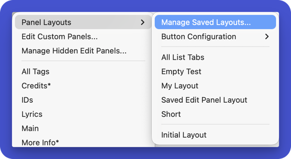
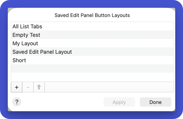
The panel displays the previous saved items. You can create, rename, delete and update saved items. When you create a new item it will reflect the current displayed button layout. You can update the contents of an existing item by selecting it and hitting the ⬆︎ button. You can rename an item by editing it inline.
One of the most powerful features in Yate is the ability for you to define your own custom edit panels. This functionality is defined in The Custom Panel Editor.
We've covered many appearance settings at this point. Saved UI layouts can be created which have the ability to change pretty much everything at once. In no particular order, a single UI Layout can modify the following:
UI Layouts are accessed and created via Window>UI Layouts. The menu lists the previously created UI layouts and a Manage Saved Layouts menu item.
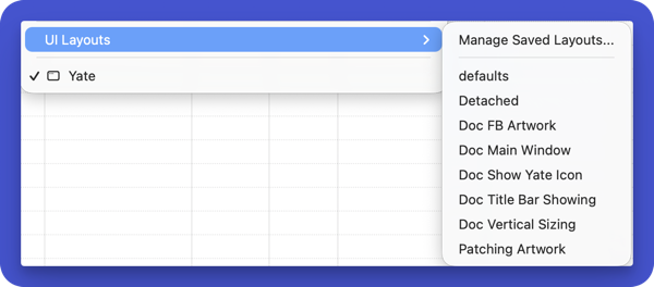
As you can see in the screenshot, many layouts were created to use when writing this document.
The previously discussed manage panels are passive in the sense that they are created with the currently defined representation and at most you can update them to a new representation. There is no granularity of the retained content. UI Layouts are different in that you specify exactly what the layout is to do. The following screenshot displays the manage panel for UI layouts.
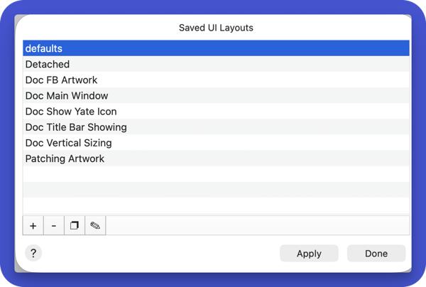
As with other manage layout panels, this one displays a list of previously created layouts.As with other manage panels, you can add, delete and rename the items. For UI Layouts you can also duplicate and edit them. When a new layout is added, it is empty. It does not reflect the current appearance ... it doesn't do anything and must be edited. The next screenshot is the edit panel for a newly created layout:
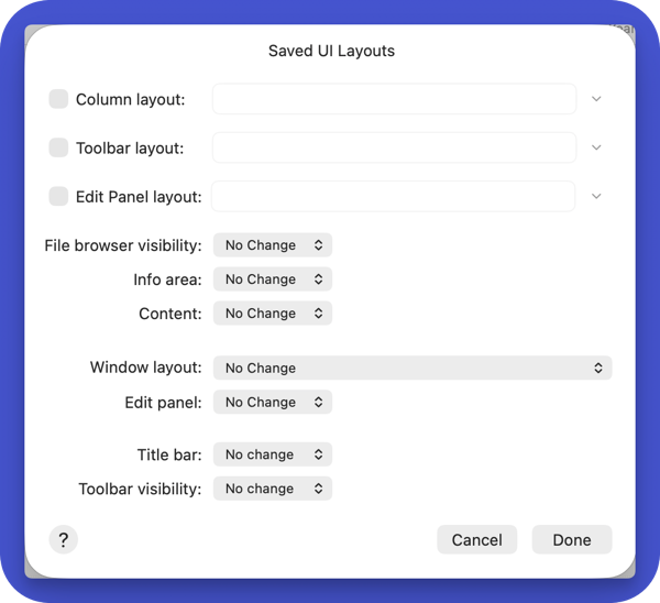
Initially everything is unassigned or marked as no change. The Column, Toolbar and Editor Panel layouts must be enabled. Once enabled you use the disclosure button at the right of the field to display a list of previously defined layouts. To make your life easier, each menu also has a Create New menu item. This item will create a new layout of the appropriate type as if it's manage panel had been used to create an item. A name will be supplied. If you later go to the appropriate manage panel and rename the item, it will ripple back to the UI layout panel.
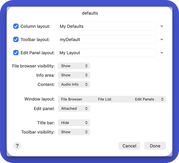
You do not have to specify every item. It's perfectly valid to leave some items unchanged. The following screenshot represents a configured item:
A toolbar button named UI Layouts Menu is supplied which lists the created UI Layouts and provides access to all four manage panels.
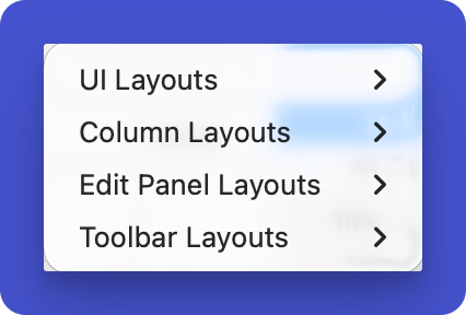
The four submenu items each display their associated menu as presented earlier in this document.
Most people won't have the need to completely modify the UI as much as we do. However, if your workflows are better served by different configurations, saved UI layouts are the way to go.
Settings - File List has a number of options which configure the appearance of the file list.
You can configure the background and grid styles to be used for the table. You can also configure the status bar to display abbreviated paths. You can choose a toolbar set.
You can configure how the Year field displays content when more than just the year is available. When set to Never, yyyy-mm-dd fields will be displayed as opposed to simply yyyy.
You can configure which items appear on the file list's context menu and where. Use the context menu's Configure button on the Settings - File List panel.
It is a good idea, to display the help for Settings - File List as most settings are pertinent to a large number of users.
The File Browser's context menu has a View Options submenu. The submenu allows you to control the following:
Most Yate windows and multi line text fields can have their font size changed via Font>Bigger (⌘+) and Font> Smaller (⌘-).
The size of text on the status bar can be changed by Font>Smaller|Larger Text on Status Bars.
Databases are used in Yate and many of the supplied resource actions. As multiple database files can be created and can be open at any given time, you can configure the appearance of newly created databases in Settings - Database - Appearance.
These settings include The background style/colour and an initial choice of font size. You can also configure how certain column types can be graphically represented.
The size of text on the status bar can be changed by Font>Smaller|Larger Text on Status Bars.
The Log Viewer is extensively used in Yate. You can change the background colour via the viewer's context menu. You can also change the font size as described in Font Sizes.
Starting with Big Sur, the OS displays iPad like vertical alerts with centered text. This style does not work well for many Yate alerts as the alerts may contain file paths.
You can tell Yate to display an alternate alert style in Settings - General Basic by enabling the Use alternate alert style setting. These alerts display similar to pre Big Sur alerts ... ie. a wider panel where the text is not centered. You can also enable the Larger text setting to use somewhat larger font sizes when displaying the alert. These settings are ignored on OS versions prior to 10.12.
| Date | Version | Information |
|---|---|---|
| 2025-02-19 | 1.0 | First general release. |
| 2026-09-20 | 10.0 | Updated for Yate 10.0. The document's version now reflects the Yate version it reflects. |
Copyright ©️ 2026 2ManyRobots. All rights reserved