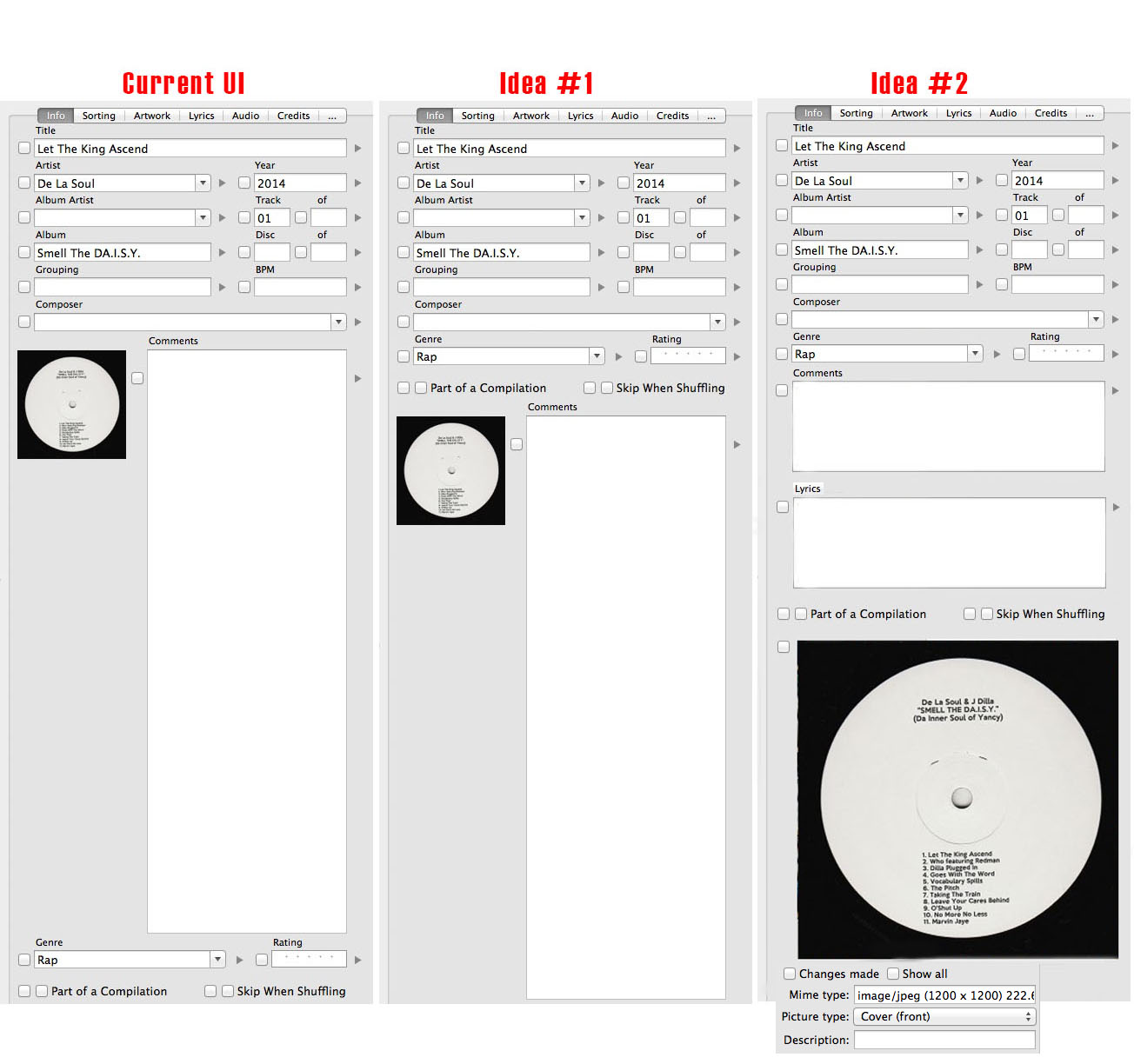
Welcome Guest

Pages: 1
UI suggestion
timpPostMarch 28, 2014, 07:30
Advanced
Posts: 54
Registered:
March 16, 2014, 13:32
Normal topicUI suggestion

I'd like to make a UI suggestion.

I think the Info tab could make better use of the space it takes up. Right now the Genre and Rating field are way down at the bottom, which makes it hard to 'eyeball' everything quickly. Therefore, Idea #1 would be to move the bottom section of the UI above the Comment field.

Idea #2 comes about because the artwork is too small when cramped up next to the comment field. I personally don't use the comment field, but if I did, I doubt I would need as much space as it's being given. I'd much rather see a larger thumbnail of the artwork below the comment field. You could then put a checkbox next to the artwork so it could be deleted or replaced. Additionally, with the extra space you get, a Lyrics field could be added below the comment. It might not show all of the lyics, but it could be a scrollable window. And if you wanted to see the full lyrics you could always click on the Lyrics tab. With this idea, you could at least see if lyrics are present from the Info tab, so you don't have to click around as much.

I've attached a screenshot of Idea #1 and Idea #2. My preference is Idea #2, as I could more easily see whether my artwork is low or high-resolution.

Thoughts?

Image

timpPostMarch 28, 2014, 07:36
Advanced
Posts: 54
Registered:
March 16, 2014, 13:32
Normal topicRe: UI suggestion

Oh, I should mention that I realize the current UI expands the comment field when you make the Yate window longer (not wider). I think with Idea #2 the artwork should increase or decrease in size, but maybe to a max pixel width of, I dunno, 500x500? That would probably be enough to check the resolution, yes?

angangPostMarch 28, 2014, 07:44
Beginner
Posts: 25
Registered:
August 23, 2013, 03:38
Normal topicRe: UI suggestion

+1 for the idea # 2 with the resolution information below.
Thanks

timpPostMarch 28, 2014, 07:46
Advanced
Posts: 54
Registered:
March 16, 2014, 13:32
Normal topicRe: UI suggestion

Oh what the heck... might as well add the artwork data to the bottom, just to have some text at the bottom of the window. Maybe the max pixels would be better at 1200x1200 or higher?

As you can see, I'm trying to get to a point where the Info tab has everything I need for 95%+ of what I actually use. 🙂

Image

timpPostMarch 28, 2014, 07:50
Advanced
Posts: 54
Registered:
March 16, 2014, 13:32
Normal topicRe: UI suggestion

Yep... what angang said 🙂

2MR2PostMarch 28, 2014, 17:41
Avatar photo
Administrator
Posts: 2079
Registered:
August 23, 2012, 19:27
Normal topicRe: UI suggestion

I'm thinking about how to implement a 'user' panel where you get to specify what fields go on the panel. That way you could pick and choose what you want to see 90% of the time.

timpPostMarch 29, 2014, 14:03
Advanced
Posts: 54
Registered:
March 16, 2014, 13:32
Normal topicRe: UI suggestion

That would be great! A "User" panel next to the Info, Sorting, Artwork, etc. panel would be a very nice addition!

PowderPostMarch 31, 2014, 17:46
Pro
Posts: 116
Registered:
March 4, 2013, 18:53
Normal topicRe: UI suggestion

Agree! I am using only ~10 fields all the time and do not care about the others… so a view with all fields in one place would be great!
So there would have to be some kind of interface builder where you could drag and drop UI elements. To efficiently use the given space, it would be handy to place small objects next to each other (not in a newline, e.g. »track number« next to »title«). I am just thinking about a similar concept as placing widgets on Android smartphones – every UI element has a certain size, e.g. 2x3 OR 6x6, and you can place them on your (gridded) panel as you please.

2MR2PostMarch 31, 2014, 18:37
Avatar photo
Administrator
Posts: 2079
Registered:
August 23, 2012, 19:27
Normal topicRe: UI suggestion

Yes it all makes sense.

Some fields are limited to a smaller size while some can take advantage of more horizontal space and some can take advantage of more horizontal and vertical space. The grid technique is a good reference but remember that the metadata panel can grow in width and height and that controls can dynamically resize. I'm hoping to take advantage of all the available space.

I have a small v2.7.2 coming out shortly and I plan to start working on, (as opposed to planning) 3.0 in the mid April time frame. (Yep, I've a small vacation scheduled in there). If some of these features can be easily isolated I'll release them as they're ready as opposed to making everyone wait for everything I have planned.

Pages: 1
Mingle Forum by Cartpauj | Version: 1.1.0beta | Page loaded in: 0.037 seconds.